The first thing I want to address here is the illustration style, because once we get those sorts of details sorted, we’ll be able to delve into the good stuff. (Okay, also because style’s way easier than the substance, and I’m trying to ease myself into this thing). There are a few different approaches I have considered, and I am going to include examples here, in the form of Clausewitz samples and some past work of mine. Forgive the weird quality of some of the images. After an epic battle, my scanner worked long enough to scan three images (luckily, the most important ones), then froze me out again, so I had to photograph and upload several of them.
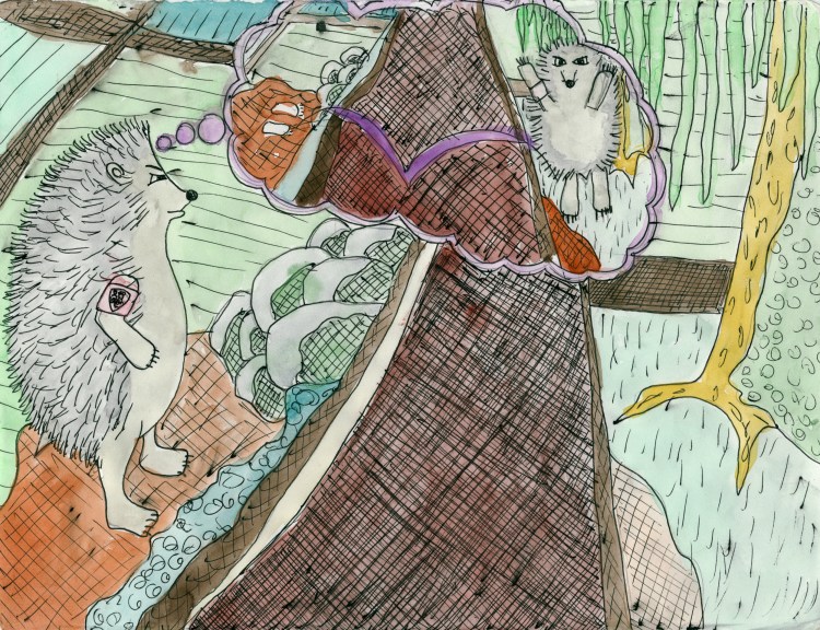
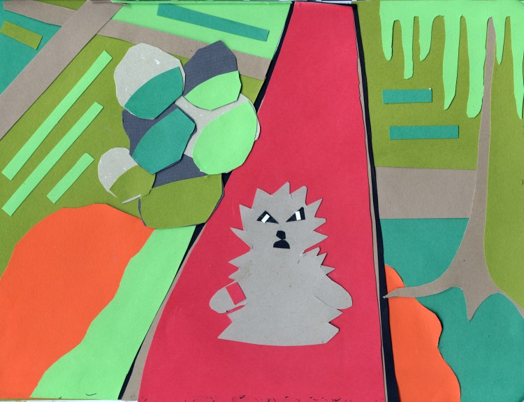
I used the line “A small jump is easier than a large one, but no one wishing to cross a ditch would jump across half of it first” for much the same reason Clausewitz did: it brings a clear image to mind. He was using it to make a point about half measures; I am using it to test styles. Please bear in mind, too, that these are just for test purposes and are not intended as book pages. Also, I don’t know why it’s a hedgehog. I guess I just felt like drawing a hedgehog.
First and most straightforward, I could use my usual drawing style. When I am drawing just to draw or to relax, I use Prismacolor markers and a very bright, colorful, flat style. The approach is something like drawing a coloring book page, then coloring it in; I use a lot of clear black outlines and blocks of color. When I was a wayward youth, I used to run around with a lot of graffiti writers. I didn’t paint, but I’d take pictures of their work, and we all liked to draw. Everyone was always drawing and doodling on everything, scribbling in each other’s black books or on napkins or discarded envelopes. I always liked drawing, but they introduced me to the beauty of art markers. Not the cheap crap little kids use, but really good markers where the ink flowed on smooth enough to make the page think it was always that color. I never picked up the wall-painting skills from my friends, but spraypaint is still one of my favorite smells, I still carry a black book for sketching, and I still use Prismacolor markers when I draw.
My subject matter varies, although I do come back to certain themes (feel free to psychoanalyze, if that’s your cup of tea), most commonly trees, snails, angels, and monsters. The monsters are not specific like the Wolfman, or the Yeti or something (although I did recently draw a Sasquatch riding a sea monster at the request of a friend), but just made-up things, sort of pure emotional expressions. Oh, and sometimes I draw things that I dream. But I am digressing too much! The point is that this is my most comfortable style, which could be an advantage in that it might make progress easier. How this style will fit in with Carl though is an open question: it sounds sort of all wrong, but it just might be one of those ‘so wrong it’s right’ things.
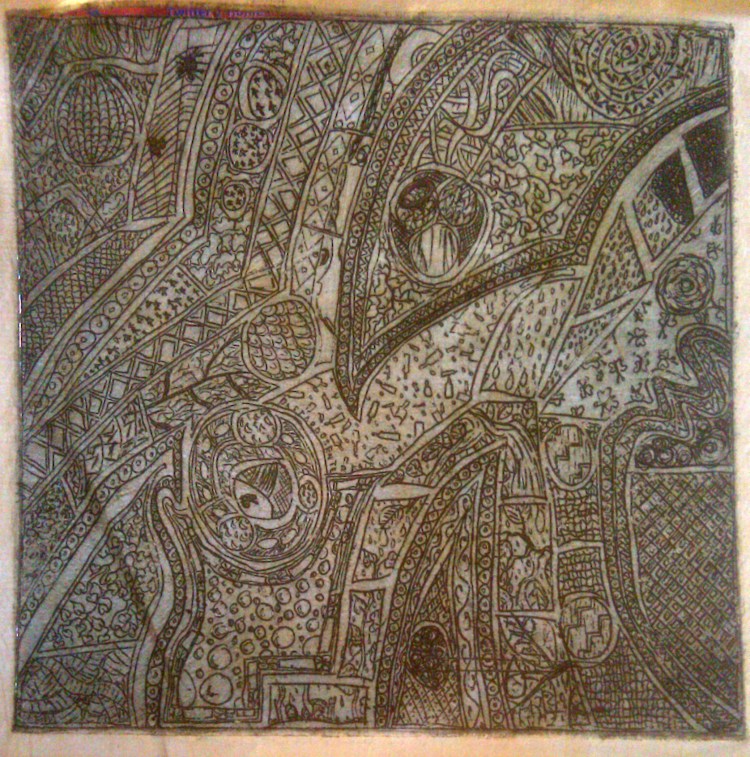
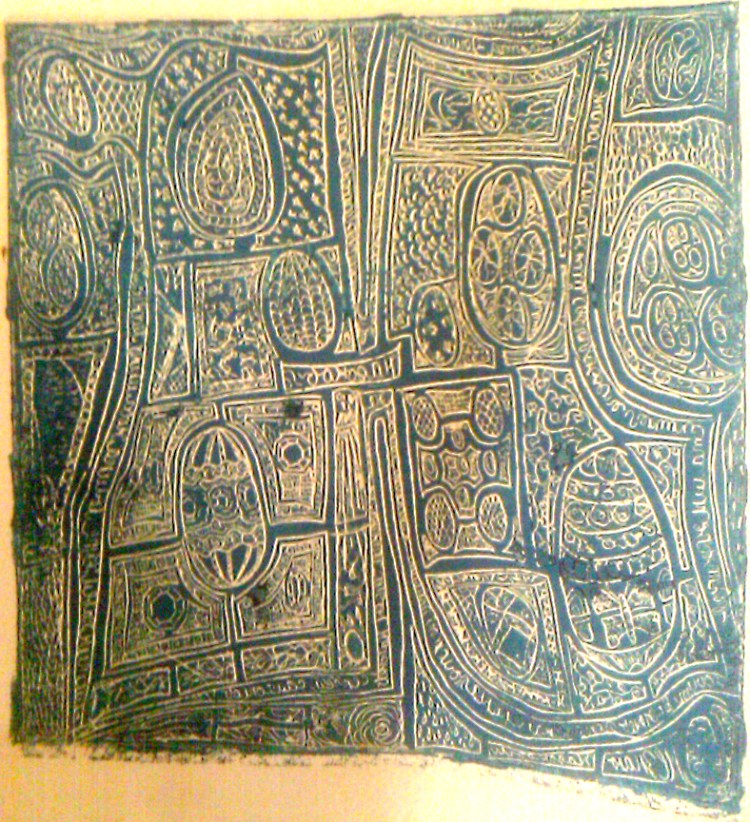
The other approach that is really appealing to me at the moment is the most logistically challenging (although not impossible) one. Which is etchings. My studio art concentration in college was actually in printmaking. Basically, to create an etching, you impress your image into a metal plate either using acid or carving into it directly with a sharp metal stylus (this latter is called the drypoint method), roll ink onto the plate, then wipe the ink off the surface, leaving just the lines holding ink, before finally running it through a press to print it onto paper. (You can also print a reverse of the etching by rolling ink onto the surface of the etched plate, making the etched lines the negative space instead of the positive). Now, I don’t have access to acid, but I do have some plates, and a stylus and some friends with a press I could likely use, so the execution would be a bit complicated logistically, but not out of the realm of possibility.
Rembrandt did etchings. Albrecht Duhrer was a master of them. You’ve seen etchings in the plates of old books. They would be very in keeping with the time of Clausewitz. The first argument against them is that they might be a little too grown-up for what is meant to be the children’s Clausewitz. On the other hand, there could be some fun to be had in the challenge of adapting the style of etching to be appealing to both adults and children, and to bring the old-school into the modern. I’ve always been a big admirer of those who use classical forms in exciting and contemporary ways (like Rimbaud did with French poetry).
(These are not the best possible examples, but they are what I had on hand).

...but no one wishing to cross a ditch... I was not able to make an actual etching for this post, so I did a drawing in the style of an etching to try and get across the idea of the linear texture of one.
Collage is an option as well, colored paper cutouts put together to make the images. I like the flat, graphic quality of this style. The scissor work can get a little tedious, but if you take the time to do it right, the final effect can be quite impactful.

...would jump across half of it first. Please keep in mind that if I were to use this style for the final illustrations, I would have a more expansive color palette, and there would be no hedgehogs.
I am not much of a one for soft lines or a lot of fluidity in my work. I like sharp lines, patterns, bold colors, so I don’t really see myself using colored pencils or watercolors for this book. The last approach I can really see taking is a combination of the above methods, possibly with photography and photo-manipulation as well, a multimedia approach where part of the image might be an etching, but collaged onto a drawing with other elements. This risks being a muddle, but if I can pull it off, it would likely be the most visually dynamic option. I will try to work up a sample soon.
Moving on to the substance of the book, as my long-winded post finally draws near its close: I had what was actually a fairly depressing conversation on Twitter today with Joshua Foust and Jason Fritz that served to reinforce my decision to take on this project. Clausewitz was crystal clear (and right) on the need for strategy, for a vision with goals and ends: “No one starts a war – or rather, no one in his senses ought to do so – without first being clear in his mind what he intends to achieve by that war and how he intends to conduct it.” I think this is one of the crucial base statements of On War, and it seems so obvious, and yet I am not convinced that those in the position to most need to remember it, do so. War is not pretty under the best of circumstances. Thinking of all the added, unnecessary ill effects that can (and do) come from waging war without a coherent strategy makes it clear that this subject matter is not an abstraction. (And read the thoughts of more knowledgeable people on similar themes, like Fritz and Gulliver at Ink Spots, and Foust at Registan.net, among many others). There is a tongue-in-cheek element to this project, and I absolutely plan to have fun with it, but I am also aware of the importance and the relevance of the subject matter, I am quite serious about executing it as well as I can.
Having said that, the next couple of posts will likely include some looks at title page design and the question of who the players will be in the final illustrations: soldiers of Carl’s time? Soldiers of today? Woodland creatures? Monsters? Bear with me through all of these stylistic debates, and I hope that very soon, this project will be ready to go onto the really challenging phase (and the one I am thinking most readers will find more interesting): content, boiling the epic tome on strategy down to its barest essence.
I have been thinking a lot about this, about how to approach it. I thought about trying to use just direct quotes. I considered attacking it chapter by chapter and boiling each down to an idea, a line or two. I don’t think either of those is right. I think I am simply going to attempt to distill On War as a whole down to its most essential ideas and state them plainly, as a children’s book should. I will continue to share my thoughts as I do so, but I welcome suggestions, warnings, etc. at any time in the comments, through email, or on Twitter, so please let me know what you think. I am eager for input on the artistic styles I shared today and on the content and the project as a whole.


I’ll have more commentary later, but for right now I just want to say: Badass.
Thanks. I look forward to hearing your thoughts.
Your quote of Clausewitz talking about the decisions involved in starting a war hold true for your decision to write a book; to paraphrase, you should be clear in your mind what your intend to achieve by this book and how you intend to craft it.
In this case it seems that form might follow function. So, if your intent is to visually and conceptually reinterpret “On War” to make its lessons understandable and relevant to a 10 year old, you might consider the framework of uncle Carl sitting his nephew down for a series of lessons on how to deal with situations he encounters in the playground, on the ball-field, in summer camp, etc. This storytelling approach probably calls for an illustration-style visualization, for which the etching style might be a nice fit.
Alternatively, if your intent is to distill the lessons of Clausewitz into plain language that even children could understand, reframe those lessons in a contemporary context, and then visually present them in way that’s appealing and approachable, your approach would probably be different. In this case, your audience is probably adults and your writing and images will be completely different. Perhaps that approach calls for the collage style which can be snarkily reminiscent of the satire on South Park.
In any case, your vision of this book’s purpose and audience may be something completely different, but thoughtfully targeting them (whoever they are) will probably help you settle on a style. Whatever your vision, I’m ready to crush some lettering!
Good points. Definitely helps to frame it. We’ll talk letters soon.
First: I think the visual style should be somewhat more classic, such as the etchings (which I love.) Let’s avoid being accused of corrupting a classic work by making light of it with overly colorful or silly pictures. In Pyle’s books (Otto of the Silver Hand, the Merry Adventures of Robin Hood, and Camelot books) black and white drawing worked to great effect and became intertwined with the stories themselves. The important thing is that we use the pictures to emphasize the text and lessons. The death of this book would be if it became about the pictures first, as in the case with so many children’s book. Also, let’s avoid any nightmarish images.
Now that I thinking about it, I wonder: what is the targeted age range of this book? Are we shooting for wee ones, or for more 5-6-7 year olds? This will have influence on how we interpret the book, and what artwork and style to use.
Thought: how about kids, dressed in uniforms too big for them, with wooden swords rough-housing? Then, the bullies come and the good uniformed kids must resist them?
As I look through my CVC right now, I think the best first step to the actual righting of this project is to reverse outline the book, so as to a get clear, well-defined and hierarchal thesis and sub-thesis (and sub-sub-thesis, etc.) You could post these and then we could argue about them to see if they’re correct. I would be happy to do this for Book 1 this week; if you’d like to see that just send me an e-mail and I’ll get started.
P.S. You could do the bully vs. uniformed kids in the misty wood style, which, on second glance, would both be perfect for that story, as well just having an awesome look generally. – Horatius
Thanks for the ideas. I am working on the text, etc now. I think if I am to really own this project, I have to do that sort of nitty-gritty stuff myself, but I appreciate the offer, and I will definitely be looking for input/reaction/criticism once I post what I come up with.
Will you do me a Misty Wood-style something someday? That is… wow. Really. I would also like an angry hedgehog like the one in the etching’s thought bubble, because his face is how I feel a LOT of the time. And I want him to be standing on a t-shirt, pointing at the words ‘BAD STRATEGY’. And I want to wear it every day until I die.
Sure. Absolutely. Thanks. The ‘Bad Strategy Hedgehog’ t-shirt might have to happen. And maybe stickers, too, so bad strategy can be clearly labeled wherever it is found.
Ohhhh my god, I would ABSOLUTELY become a member of the Bad Strategy Sticker Army (or the BSSA, to those in the know). As long as we could extend it to continued sources of potential strategic miscalculation, of course.
Saw you were still looking for input on Twitter. Honestly, you should choose the illustration style you like best, since you’ll be living with this project for some time, but that being said, I like your example of collage best. I understand it may be more work than you want to put into the illustrations, (that could be a lot of cutting), but maybe you could reuse some of the pieces if you just lay them down and photograph them? I’m not an artist, so I’m not sure if that is possible. I’m looking forward to what you show us next.
P.S. A Bad Strategy Hedgehog t-shirt sounds very interesting…
Colin Gray talk lots about the strategic hedgehog, you could paint the strategy bridge as well.